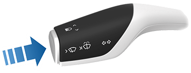
Four grids of uniform buttons, they think that's an improvement over a touchscreen? There is zero practical distinction between taking your eyes off the road to see which button you're pushing vs taking your eyes of the road to see which part of the screen you're touching.
GOOD HVAC/radio design means you can perform ALL essential functions WITHOUT taking your eyes off the road AT ALL, once you've spent five seconds learning what's where. The controls should be in locations where it's hard to mistake one thing for another. The controls should also be differently shaped and different types. Give us knobs and sliders!
Unlike a touchscreen, you can feel the line between adjacent buttons and between buttons & the surrounding dashboard. Unlike touchscreens, you can touch these without triggering them, use feel to locate the correct button and center your finger on it, then press it, all without taking your eyes from the road.
Could they be even more distinct? Sure. Are these still a huge improvement over a touchscreen? Absolutely.
I have seen a touch screen covered by a thin layer of plastic in the button row that has some indentation so the finger can feel where the buttons are. This was on the control panel of an industrial machine. With some small sound or haptic feedback when the button is being pressed, this allows someone familiar with the interface to quickly press some buttons while operating the machine.
(There was also an indentation for a slider on the side)
I mean that is cool, but afaik literally no one has ever done this in an automotive product. Probably because this flexible screen would turn crap after 10 years of non-stop inflating/deflating, or wouldn't operate in conditions that cars actually exist in(-30C/+40C operating temperatures are standard for automotive screens, as soon as you add any kind of flexible plastic you definitely lose that).
A slightly sarcastic “just” on my part, haha. Considering that the original idea (also a later project GelTouch[1]) never lead as far as I’m aware to any shipping products, I doubt they thought about specific automotive needs.
There is zero practical distinction between taking your eyes off the road to see which button you're pushing vs taking your eyes of the road to see which part of the screen you're touching.
There is, in fact, one large difference. With a button you know you’ve pushed it. Once you see where to press your eyes can go back to the road while you actually press the button since the feedback indicating it’s been pressed is tactile.
That’s just a button though. That scenario is magnified with any sort of adjustment slider.
I just got out of a rental with a touchscreen climate controls and it was significantly less safe just adjusting the heat.
Car touchscreens also have tactile feedback - they produce a click and a vibration when a press is registred. This works well. What doesn't work at all is being able to find a button without looking.
Largely, no they don't. Most models I've seen (including, the usual whipping boy Tesla) do not have any haptic feedback on their touch screens. Noises when clicking something is more common, though.
Great, we have gone from a horrible and extremely unsafe design to a bad and mildly unsafe design.
What happened to the ~5 decades of design ranging from "decent" to "great"? Even the worst-designed dashboard of the early 00s was better than what we have now in many cases. Give me my damn knobs back.
I was going to agree, from the description above, that this was still a bad design.
But having looked at the picture, it seems fine. There are four sets of buttons that do different things. It will take negligible time to locate the one you want, after which you can stop looking at the panel. The buttons won't move and you'll be aware when you've pressed them.
Well designed button layouts use tactile differences so you can non-visually identify where you are without conducting a sequential search. Button clusters are restricted to groups of three or two with distinctive shapes or raised features that permit rapid acquisition of the intended button. You can't do that with a uniform, flush button strip. That's just designer wannabe BS where form is everything and function is ignored.
I think clearly Hyundai have taken an approach that improves dramatically on the 'buttons hidden behind touchscreens' menus' which has started to plague cars with touch screens.
The result is a dashboard that has decent form and decent function as opposed to great form terrible function. They aren't going for impeccable function here.
When a company tries to do the right thing and publicly calls out flaws in design iterations that we have disliked, lets not shoot them down for not getting it perfect.
To say its "form is everything where function is ignored" is just an overreaction.
While I agree that Hyundai's console design is seriously lacking, anything immovable/unchangeable has a key benefit over touchscreens: it can be habituated.
Personally I find any interface that can move while you use it to be borderline anger-inducing (the Google Cloud Platform console comes to mind immediately). In a car it's deadly. Gimmicks move gadgets though, so we had to let some designers and product managers get their bonuses/promotions and then pivot into an "epiphany" (sans the mea culpa) to get to now.
I dare say the thought process is that, does it really matter over and above how they have already designed it?
If you spend enough time in your own car you will get pretty darn good at finding your buttons with the smallest of glances. I don't think car designers really see the benefit, when they're constantly changing their dashboard designs.
That's a recipe for keeping horses rather than cars.
Designs should change and improve as technology improves, however it needs to move in a responsible direction. What we had 50-70 years ago is quite different from what we have now.
I agree entirely; this is lazy design. Cars are the most dangerous machines we’ve invented, by orders of magnitude nothing else causes as much unintended harm. It’s really, really worth doing the best possible job in the control surfaces for these machines.
They’ve prioritized visual consistency over usability. For example, why do the Volume and Tuner knobs look identical? They’re for different purposes, used in different ways and in different contexts. They’re even usually used by different _people_ — the volume knob is more likely to be used by the passenger, for instance.
And yet, they’re more related to each other than they are to the buttons placed between them, like Search and Map. All those buttons seem essentially arbitrary to me. Are Seek and Track really as important as Setup? Why have a rarely-used and interruptive feature like Setup right next to an often-used and non-destructive feature like Favorite (I’m guess that’s what the star means)?
I’m still glad they’re real buttons rather than a touchscreen. But you’re totally right — this is exceptionally lazy design and implementation of physical buttons.
And if I may — I’ve seen replies already to the effect that the usability of this interface doesn’t matter, either because it’s not a big deal to begin with, or because drivers will get used to anything, or for another reason. That’s missing the point — usability is for everyone, all the time. Even exports make mistakes with unusable controls.
> For example, why do the Volume and Tuner knobs look identical? They’re for different purposes, used in different ways and in different contexts. They’re even usually used by different _people_ — the volume knob is more likely to be used by the passenger, for instance.
Given that they’re so far apart, I don’t see why they should be physically different from one another. Also, the standard position of the volume knob is on the left, the tuner knob on the right. This is how it has worked in any car radio I’ve ever seen when the knobs are arranged horizontally like that. They’re both within easy reach so trying to statistically determine which occupant is most likely to operate which knob doesn’t seem very useful.
I agree with everything else you’ve written. I hate it when disruptive controls are mixed in with less-consequential ones. This design could use some improvement, but it’s also substantially better than the touchscreen-only alternative.
Not identical: they typically have raised markers on two of the home row keys precisely to help with orientation. And, well, your hands are already positioned over them much of the time, so relative identification is much easier. Not so with these buttons.
These are in 4 different blocks with only 4 each, I don't think this is terribly hard without looking. And it's not like these are functions like windshield wipers that would typically go somewhere else. Looks more or less like typical buttons to me.
The bottom two blocks are fine, I agree, because they're laid out in two dimensional so if you feel around for the corners and identify the buttons that way.
The top set of buttons arranged in a line are much worse. They're two sets of 4 in a sense, but they're nearly undifferentiated from the hazard lights button, so in reality it's one long strip. I strongly suspect that people will take their eyes off the road to look at those buttons more often than not.
(Yes they're media controls, but let's be honest: people will use them to skip tracks while driving.)
Not sure I'm using them even unconsciously. Because every time (admittedly not often) that I get a new keyboard I type shifted (as in djogyrd instead of shifted) for a while.
If i'd be using those raised markers I wouldn't take so much time to adapt I think?
That’s not analogous. Proper use, or accustomed use, of a keyboard places the hands in the correct position by default. Our hands don’t remember the _absolute_ position of those buttons, only their position _relative_ to other buttons.
Buttons in car control panels require users to leave the default position of hands-on-wheel and acquire the new button. That’s an expensive operation, and it’s well-studied — https://en.wikipedia.org/wiki/Fitts%27s_law
Also, keyboard layouts are static — learn QWERTY once, use it forever. Car control panels are usually different between cars, so learnability is harder. Many people regularly drive multiple cars, increasing difficulty again.
Core functions like HVAC and hazard lights deserve dedicated controls, but modern cars also need a type of input that can be used with a tablet-sized display. What to do?
*Rotary Encoders*
The best type of input for a car is a rotary encoder, a knob with tactile "clicks" that register as you turn it. Good ones can also be pressed down like a button, and moved in cardinal directions like a d-pad.
Have one for your volume knob: pressing it down toggles muting.
Have one for the main controls: twisting moves the cursor, swiping changes which app is selected.
Have one on a steering wheel stalk, to cycle between display modes on one of the dashboard display's rounds.
This actually looks like a really practical design to me.
Maybe I've been driving the wrong cars, but I don't expect to be able to feel around blindly to find the right button to press (although, to be honest, that does seem like it'd be doable with this Kona design). I do expect, however, to be able to glance at the button panel and quickly get a fix on the button location so that I can look back at the road while my fingers to the rest. This design would certainly enable the latter.
> There is zero practical distinction between taking your eyes off the road to see which button you're pushing vs taking your eyes of the road to see which part of the screen you're touching.
Practically, I don't need to take my eyes off the road to press an analog button, that I am familiar with, having a small chance to fail (to register the interaction). Touchscreens are notorious for not registering interaction, which is why using a touchscreen keyboard is inferior.
Do you have any good examples of a car or plane that can be operated that way? I'm not aware of any.
Taking a glance to co-locate your finger and a button or knob is far faster than doing so with an element on a touchscreen. And the latter requires visual attention throughout the interaction.
Also, I would wager that keeping eyes on road while mentally finding a button or knob without looking is actually more distracting than taking a quick glance for it.
There is absolutely a difference. You probably typed this entire message on your desktop or laptop keyboard without looking at it. Could you do the same on a touch keyboard on your phone? Buttons staying in the same place and giving tactile feedback makes all the difference.
The design in the linked picture looks just about like any other non-touchscreen car in the world, and is perfectly usable.
and yet, here I am, typing on my keyboard, which is above my eye level while I lay on a couch eating a burrito with my latop on my belly. And I don't even have to see the keys... they should alternate every single key with a knob so I know the difference.
You can take your eyes of the road for a little bit my man. You do it all the time anyway when checking mirrors. Yes, knobs and sliders would be better but this is a good compromise vs exclusive screens.
Also, as per the other content: you can type and remember 100+ buttons.
Four grids of uniform buttons, they think that's an improvement over a touchscreen? There is zero practical distinction between taking your eyes off the road to see which button you're pushing vs taking your eyes of the road to see which part of the screen you're touching.
GOOD HVAC/radio design means you can perform ALL essential functions WITHOUT taking your eyes off the road AT ALL, once you've spent five seconds learning what's where. The controls should be in locations where it's hard to mistake one thing for another. The controls should also be differently shaped and different types. Give us knobs and sliders!
Is anyone even awake in car design depts anymore?