My first thought on seeing this headline was "what, again?"
Don't get me wrong, the new design looks great, but it feels like every six months they switch between having side navigation and putting everything on top. Every time they change there's a definite improvement, but you'd think they'd be able to come up with a design that works for at least a few years.
My thoughts exactly. We've used GitLab since version 6 [1] and things have always felt like they are in a state of flux ([2] [3] [4]). For an open source project this is tolerable. I do wonder what enterprise users make of this constant UI change? Now that the navigation is back on the left, we'll probably see it collapsible in 9.5 and then morphed into a horizontal bar by version 10, rinse and repeat.
As someone who has never used GitLab, it is perhaps interesting to note that I would have literally no idea of the chronology of those images you've linked; if I had to guess, I would say the grey one (1) looks older than the purple one (4), but the other two look almost entirely unrelated.
The images 1…4 are in chronological order, the URLs contain the version if interested. However, should you look at them in any order or sequence, it goes to show how different the UI has looked throughout the life of the product.
> For an open source project this is tolerable. I do wonder what enterprise users make of this constant UI change?
That's interesting to think about. What is the difference between the two types of users? Is it that the open source project is in no hurry and can accept a delay due to interface hassles? Is it that enterprise users are less capable and need a stable environment to function?
From my exposure to enterprise users, they are usually the sort of environment where hundreds, if not thousands, of employees work. Can you imagine how one "angry" of UI changes person in a team of a dozen scales set against that? With open-source users, it's more decentralised IMHO.
From my exposure to enterprise users their Gitlab updates will be wedged in the middle of a 2 year change control process and will jump over many iterations of design changes
If they were clever, they could structure the release schedule so that the enterprise customers which started with top navigation will renew when the top navigation is current again, and those who started with side navigation will renew when side navigation is on the mainline... ;).
When I read your questions, I immediately though:
Enterprise users need processes. Processes goes by documentation. If you have to change your documentation once every 6 months because the blue button on the bottom left is now yellow on the top right...
We are glad to hear you like the new design and feel that each change has been an improvement. We value iteration here at GitLab, making the smallest change possible and getting it out as quickly as possible. This allows us to ship, gather feedback, and readjust quickly. You can learn more about our process here: https://about.gitlab.com/handbook/values/#iteration
Agreed; changing business software for change's sake is plain evil and will cost you customers. People still use the Bugzilla UI with 76 mandatory input fields and like it that way.
I believe that you're expemplifying survivor bias. People use Bugzilla despite its horrible UI (and in fact, I know of several teams that have GreaseMonkey scripts that create an alternative UI on top of the base Bugzilla one). Bugzilla does a lot of things right, but its UI is not one of them.
GitLab had similar problems with its UI, and they've been improving it. Personally I welcome the improvements (though we use CE and not EE internally).
Salesforce is a great example. It is amazingly "old fashioned", tiny and uses non of the UX paradigms of the last 10 years. However, it gets work done really, really well.
I'm disregarding the Lightning-UI versions for now.
I think Salesforce's advantage is its ecosystem and integrations.
However, I would not cite Salesforce as a reference for good UX. It is very labor intensive to get where you need. It takes a ton clicks to get places within the CRM—simple places like to find a contact profile. The Lightening UI makes the click areas for buttons and fields larger, but does not reduce the time or effort it takes to get places within the CRM.
My previous company, Trustfuel, built a business off of Salesforce being a pain for customer success managers to use. Note taking also sucks in Salesforce—Get Pattern's business is building a better note taking tool for AE's.
Since you are redesigning UI features, are there any plans for a site-native dark theme? Seeing as there already multiple code themes available, it seems within the context of the configurable UI part of the goal. There have been Stylish themes for gitlab in the past but they break a lot because gitlab is a very large website to try restyling from the outside.
Solarized-dark with a white frame can be quite grating on the eyes.
All of my other code workflow (terminal and editor) is in a dark theme, having to switch to GitLab to review an MR can actually be quite uncomfortable to do because there's such a leap in contrast.
The dark theme I use is Dracula[1], it's a really beautiful theme and if there was a way to view GitLab using it it'd be incredible.
The point was that while the code frame has a dark theme, the webpage around it still blasts you with light, which causes the strain. GitLab doesn't support themes across the whole website (yet?)
I'd love native support for a dark theme! As a workaround, I've found darkreader's (browser extension) default handling of Gitlab's light UI elements to be exactly what I want. It handles about 90% of other sites I frequent effortlessly and is easily toggled with a keyboard shortcut.
There is an issue for that https://gitlab.com/gitlab-org/gitlab-ce/issues/18596. It has not been our priority as we have been working on the navigation but it is something we are keeping in mind for future focus :)
GitLab are one of the only companies I really look up to as a UXer. You guys just Do It Right. Thanks for being so transparent into your process and even sharing InVision prototypes. More companies should do this.
If anyone at Gitlab is reading this, please, please, please do something with the wide blank space at the top of the home page of a project.
The project logo, name and short description are really side information that you don't care when you are working everyday on the same projects.It is a waste of space that distract the user and does not let him jump right into the code.
Cheers and thank you
I don't often use Gitlab, I just logged in this morning to update my 2FA and saw the new nav in the profile. Enabled it and instantly felt a lot more compelled to use the site.
I'm a big fan of your guys' work but using Github for a variety of reasons (UI is a big reason why), so I really mean it when I say the improvement is noticeable.
BTW, have you thought about talking to Zenhub to get a "Zenlab"? Given that Gitlab implements a lot more than Github in terms of Zenhub features it might be worth looking into.
We have not talked with them. I love the work of ZenHub. But our strategy would be to add the features to GitLab itself instead of running it in another application. Feel free to submit/upvote an issue for something you would love to see.
Zenhub being separate from Github has actually been kind of a nice thing for us. And I can imagine it's a good deal for github as well -- I think Github adding all the features that Zenhub offers would be massive bloat. It being separate and easily removed makes it much nicer.
It's qualitative research: as long as you take sufficient precaution picking the subjects to avoid obvious blind spots, it should be enough to get a rough idea of glaring mistakes or problems and to get a good feel of how users perceive and navigate the UI. It also allows you to individually observe effects that would often be "averaged out" by a larger sample. It's being used as a first step (before they conduct a broader quantitative research) so it sounds pretty valid.
GitLab’s UX Researcher here. TheCoreh has summed things up well but I thought I’d share my own thoughts.
During usability testing, you eventually reach a point where users start demonstrating the same behaviour. Once that happens, it’s not really worth speaking to more users, as you’re not learning anything new. You’re better to implement changes based on the user feedback you have and then re-test with different users. The navigation has been through 3 rounds of usability testing (24 users in total). Sometimes we tested with more than one prototype at once, hence us testing with a few extra users.
We conducted usability testing to get us to a point where we felt comfortable sharing the new navigation with a much wider audience. There’s still more research to come!
On the other hand, you do not need to run a scientific study to make every UX decision. There is a lot of "information" (in an abstract sense) in a person's intuition, experience and common sense. Using a small usability group to validate is quite sensible.
It's a slightly more formalised version of the 'corridor' UX test, where you grab the first person passing in the corridor and find out what isn't obvious to them about what you've just built.
I really like the UI paradigm built by gitbucket - https://gitbucket.github.io/. Its like they took Bitbucket and made it better.
On that note - I cant believe how unusable Bitbucket is.
P.S. And obviously love the fact that it is a single jar file deploy.
GitBucket's UI used to be a full rip of GitHub until they received a notice to change it [0]. They then switched over to using a UI built with AdminLTE [1]. I'm not sure if the current UI is still based on it though.
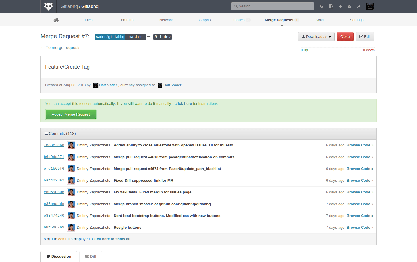
Something I found missing is the missing shortcut to easily go the page of "merged request assigned to me" (which is the link 'merge request' in the global menu) as it's the single page I visit the most every day at work, to see across all projects , the merge requests that i need to check.
The third icon from the right is a quick link to "Merge Requests Assigned to Me" and it is the same as in the old version of the menu. The quick link in the hamburger menu was simply a duplicate place to find this action.
To see all "Merge Requests" in a project, you will find that option in the sidebar now, as that is contextual to the Project you are in.
Sorry , I meant "keyboard shortcurt" , I know the link on the left menu is to go to this page, but at least in 9.2, if you have a long page, you need to scroll up to the reach the top, which is inefficient, and for which a keyboard shortcut would be extremely welcome. There's already one, but for only the merge request of the current project.
In practice, it comes across as something of a hybrid of Github and Bitbucket's UI-- the top gobal navigation bar and sidebar navigation structure are very similar to Bitbucket's, but they take Github's "code first" approach to displaying repositories (the first thing you see when opening a repository in Gitlab or Github is the source tree; on Bitbucket the first thing you see is the readme and a summary of bug reports).
It's probably also worth mentioning that Bitbucket's also in the process of a massive navigation redesign; the "new" Bitbucket eliminates the top global navigation bar, moving some of its elements to a new sidebar (beside the context-specific sidebar) and eliminating much of the global navigation elements completely from repository pages (want to go directly from a repository page to a team or project page? You can't unless it happens to be in the repository's breadcrumb bar.). This is about as much of an improvement as it sounds like.
(Sorry, no screenshots of the new Bitbucket UI since I can't quickly produce one that doesn't have private info in it.)
" the top gobal navigation bar and sidebar navigation structure are very similar to Bitbucket's, but they take Github's "code first" approach to displaying repositories (the first thing you see when opening a repository in Gitlab or Github is the source tree; on Bitbucket the first thing you see is the readme and a summary of bug reports)."
Thanks for the feedback! Glad you spotted the differences between BitBucket's Design and our own. While we would love to design with a blank slate, we are not. Our users arrive with expectations and deeply implanted ideas of how things should look, feel, and behave. We have to temper exploration with practicality. The downside of that can be that the UI has a similar appearance to other platforms.
Apart from a basic 3-parts layout, I can't spot too many differences. BB is organised around actions first (actions in the menu, big "create" buttons, etc. even the access level has easily reachable "revoke" for some reason), GL is more about notifications and exploring. (shows the files instead of "you didn't create README" by default) The layout they put it in seems like the least interesting bit to me.
This looks nice, but hopefully this is a "stable" release for a while, in the last versions so much stuff moved around navigation wise. I especially like that the three vertical navigations (http://imgur.com/UN1TDkw) in a repo are gone.
Thumbs up for creating such an awesome product and involving the community in your thought process!
Thanks! We would love to hear your feedback as you use the new navigation. Our goal here is to get as much input from the community as possible to make improvements over the next few weeks. You can leave thoughts on the issue here: https://gitlab.com/gitlab-org/gitlab-ce/issues/34917
My main gripe with gitlab navigation is I can't see the languages split up (chart) quickly like in Github. Other than that since I am not a heavy user of the website (more on time on git than on website) I find no other problems. Also the redesign looks better than before. Hope they also introduce a dark theme. (would love to have this one)
Thanks for the feedback! In 9.5 we'll be introducing fly out dropdowns that will allow users to easily access sub-menu items from the sidebar. This will make it super fast and easy for you to reach the charts page from anywhere within a project. Follow along in the issue here: https://gitlab.com/gitlab-org/gitlab-ce/issues/34026
Hope, the design would be good. The issue I have faced so far is that the navigation (and several other features of GitLab site) doesn't work well when javascript is turned off. The equivalent features in Github works without javascript with no much issues.
Thanks for your feedback - I'd like to see some more things work without javascript as well.
For the navigation, the links and buttons all work. For more complex components like dropdowns and search we require JS. We have considered server rendering for new things, but for now it is quite high effort for comparatively low gain.
You can tell someone is copying someone else's work when they copy the bad stuff. The search box on GitHub and now GitLab wastes space with "This repository" spelled out. It's also odd that you get more space to type when you're not searching inside of a repo, and that backspace is how you switch to a more general search. Pity. I thought that GitLab had learned their lesson and stopped copying GitHub.
Aside from that, it sounds like a well thought out feature, and it's good that they're redoing it instead of just changing it bit by bit.
Even if they have taken UI cues from elsewhere, I don't think this is a bad one. The search box is in the global context section and it's important to signal that it's going to behave in a non-global way. Having a flexible width text input or making it expand over the 'This Repository' hint (or whatever other context hint is there at the time) would be an easy solve for it being too small.
>You can tell someone is copying someone else's work when they copy the bad stuff.
Once people learn a UI, they really hate deviations from it. It doesn't matter whether githubs UI is good, and it doesn't matter whether gitlab's UI is better. People are used to github, and the peanut gallery will bitch if things are different. The trick for gitlab will be in finding the UI differences that give the maximum improvement for the minimum change. That's what will give the desired sensation of "clearly better than github". Overdo it, and it'll feel alien and weird.
"The trick for gitlab will be in finding the UI differences that give the maximum improvement for the minimum change."
This is the holy grail of UI for sure. We are striving for this in all of the decisions we make on the UX team. This change required a lot more change than we would have liked but we are implementing it in a way that we hope will bring maximum effectiveness and longevity.
> Once people learn a UI, they really hate deviations from it. It doesn't matter whether githubs UI is good, and it doesn't matter whether gitlab's UI is better. People are used to github
This used to be called the "do it like Amazon" rule, which was valid until about 2004-2005 or so.
> backspace is how you switch to a more general search
I actually love this feature on GitHub and wish it was a universally-accepted UX pattern so I could do it places like Amazon to remove the pre-selected category in their search bar. The convenience of the backspace outweighs the space the label takes in the search bar IMO, though GitHub could have made it smaller by shortening it to something like "this repo"
Layout is nice, but the header color... uh... it's like a bike shed, but a header ;)
GitLab should consider adding an option somewhere, that lets users override a few primary theme colors to their liking. Not a full-fledged theme engine - that would be awesome but would take a lot of time to implement - just a few light CSS overrides that are persisted in the account settings, don't require browser extensions and more tolerant to the layout changes.
Thanks for your feedback! We will be adding color palette options for differentiating instances in an upcoming release. You can follow along in the issue here: https://gitlab.com/gitlab-org/gitlab-ce/issues/35012
> We knew from previous feedback and from our research that including the global navigation links on the top navigation bar was superior to hiding them in a hidden hamburger menu.
Heads up for the Gitlab people here-- The user preferences link under try it yourself 404s for me, both when logged in and out. Excited to try out these changes though!
Edit: Appears to be the same path but with `about` subdomain
GitLab should make it so that anyone who reaches a 4xx or 5xx error page should be able to trivially (as in one click from the error page) file a bug about it on the GitLab tracker. Make sure to pre-populate the template with URL, status code, and referer.
You're assuming they're not doing that automatically in the background. I'd rather assume that they're already getting at least all 5xx reports. (it would be a big failure otherwise)
Do they really? We're considering switching from self hosted CE to Gitlab.com EE. Reliability and speed is what we're concerned about regarding the switch.
Sorry to hear you're experiencing issues. Are you still affected? Are you logged in? If so, could you please open an issue in https://gitlab.com/gitlab-com/support-forum/issues with as much info as possible?
Don't get me wrong, the new design looks great, but it feels like every six months they switch between having side navigation and putting everything on top. Every time they change there's a definite improvement, but you'd think they'd be able to come up with a design that works for at least a few years.